

Kota Kinabalu air quality map
Live air pollution map of Kota Kinabalu
11.5K people follow this city

Full screen


Contributors category
0
Government
0
Educational
0
Non-profit organization
0
Corporate
0
Individual
0
Anonymous
Station(s) operated by
*IQAir’s AQI data modeled using satellite data. Learn more
Health Recommendations
 | Sensitive groups should reduce outdoor exercise |
 | Close your windows to avoid dirty outdoor air GET A MONITOR |
 | Sensitive groups should wear a mask outdoors GET A MASK |
 | Sensitive groups should run an air purifier GET AN AIR PURIFIER |
Kota Kinabalu does not have air sensor data
Be the first to measure and contribute air quality data to your community.
News
The latest air quality news and resources.

Understand air pollution and protect yourself
Kota Kinabalu MAP AIR QUALITY ANALYSIS AND STATISTICS
Can a lot of important information be seen on the air pollution map for Kota Kinabalu?
There is a lot of very interesting information about air quality on the air pollution map for Kota Kinabalu. The map is very easy to open from the main city page. Merely select the map icon at the top of the city page and this new page will open which is filled with all relevant information about air quality.
When the page is first opened, the viewer will see an overall colour across the entire map. This reflects the current air quality which is green and means the air quality is “Good”. The colours can range from pale green to dark maroon and are standard throughout the entire IQAir website. The darker the colour means the worse the air quality. The viewer will also see one or more coloured circles or discs which represent the location of the ground-level air monitoring stations, although Kota Kinabalu has no such stations as it relies entirely on data provided by overhead satellites. The outcome is just the same.
Displayed within the centre of the discs is a number which represents the United States Air Quality Index number or US AQI for short. The figure is calculated by taking measurements of up to six of the most commonly occurring air pollutants found in city air. They are usually both sizes of Particulate Matter (PM2.5 and PM10), ozone, nitrogen dioxide, sulphur dioxide and carbon monoxide. Once established the number is then used as a standard when comparing air quality in different cities. It is both encouraged and endorsed by the World Health Organisation (WHO).
Briefly looking back at the main city page, the coloured banner at the top tells the viewer that the air quality is currently “Good” with a US AQI reading of just 25. The main pollutant recorded was PM2.5 with a level of 6.1 µg/m³ which is slightly over the suggested target figure of 5 µg/m³ as recommended by the WHO.
Is there a lot more really good information about air quality on the air pollution map for Kota Kinabalu?
There are more interesting facts about air quality on the air pollution map for Kota Kinabalu but the page needs to be viewed at a maximum size in order to see all information. The icon to select this mode can be seen at the top of the page.
Once viewed in this way, a list of four options will appear down the left-hand side of the screen. Each of the choices can be turned on or off to give a better idea of the effects they have on the map.
The first choice would show the positions of the ground-level air monitoring stations and even though there are none in Kota Kinabalu, there is one just north of Pulatan which is relatively close to the city.
The second option shows the location of any wildfires that might be burning in the vicinity, but in November 2022, there were no such icons to be seen on the map. If there were any fires burning out of control then option four needs to be consulted as this shows the speed and direction of the prevailing winds and might indicate where the ensuing smoke will blow to.
The third option can change the background colour of the map to reflect the current state of the air. If the intense colour is too distracting then it can be disabled and the colour will revert to a more subdued palette.
There is more information on the air pollution map for Kota Kinabalu over on the right-hand side of the screen. There is a table here which shows the ranking of world cities according to their levels of cleanliness. There are only seven shown by default, but more can be seen by choosing the “full ranking” option where the rest of the participating cities can be seen.
Is the source of the polluted air visible on the air quality map for Kota Kinabalu?
The source of the polluted air is not directly shown on the air pollution map for Kota Kinabalu, however, most pollution comes from a combination of several sources. The manufacturing industry is responsible for the emissions of nitrogen, sulphur dioxide, hydrocarbons and carbon dioxide which have brought side effects to environmental life.
The burning of fossil fuels (petrol, diesel, etc.) from motor vehicles produces carbon monoxide gas, nitrous oxide, and hydrocarbons contributing to air pollution.
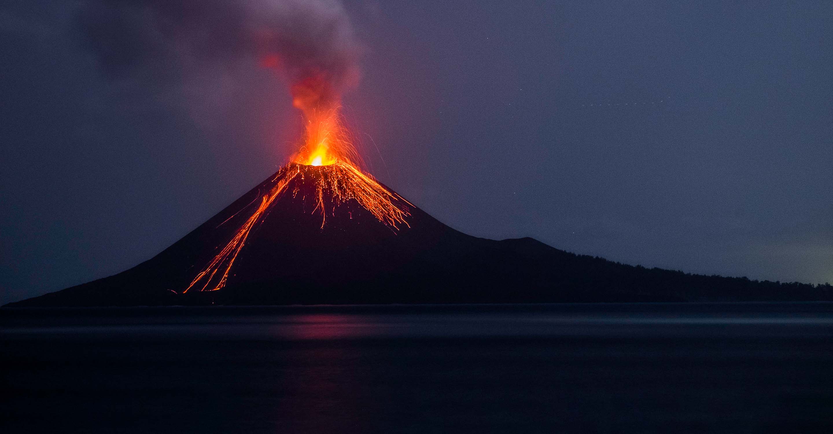
Open burning often occurs in the area of landfill sites, waste disposal and industrial solid waste, construction sites, plantation waste and garden waste. Forest burning for the purpose of exploration and plantation production, especially for palm oil is extensive in Malaysia and Indonesia.
The problem has accelerated in recent years as more land has been cleared for expanding plantations for the lucrative palm oil trade. The burnt land also becomes drier, which makes it more likely to catch fire the next time there are slash-and-burn clearings.
The slash-and-burn technique employed by many in the region is arguably the easiest way for farmers to clear their land and helps them get rid of any disease that may have affected their crops.
But it's not just small-scale farmers at work here. The concern is many of these fires are started by big corporations that want to plant oil palm plantations.
Indonesia is the world's biggest producer of palm oil and the demand for the commodity has been rising. This means there is a need for extra land for palm oil plantations.
PM2.5 is used as a standard on the air pollution map for Kota Kinabalu, but what is it?
Air pollutants include gaseous pollutants and particle matter (PM). The pathogenicity of PM is determined by their size, composition, origin, solubility and their ability to produce reactive oxygen. Studies have shown that smog is generally caused by high concentrations of fine particles referred to as PM2.5 or aerosols. It has been found that particles with an aerodynamic diameter smaller than 10 microns have a greater impact on human health. One group of particulate matter identified, PM2.5, have small diameters, but large surface areas and may therefore be capable of carrying various toxic stuffs, passing through the filtration of nose hair, reaching the end of the respiratory tract with airflow and accumulate there by diffusion, damaging other parts of the body through air exchange in the lungs.
PM2.5 causes asthma, and respiratory inflammation, jeopardizes lung functions and even promotes cancers, its impact on human respiratory system should not be dismissed. It is especially exacerbating for people with existing respiratory problems.


