Rome air quality map
Live air pollution map of Rome
61.7K people follow this city
Full screen
Contributors
6
Stations
7
Contributors category
0
Government
0
Non-profit organization
0
Educational
2
Corporate
1
Individual
3
Anonymous
Most polluted air quality stations
| # | station | US AQI |
|---|---|---|
| 1 | via Alessandria 88 - sede ARvis.it | 84 |
| 2 | RE DI ROMA | 55 |
| 3 | Viale Pinturicchio | 25 |
| 4 | Arvis Tufello Montesacro | 23 |
| 5 | Viale Tito Labieno | 12 |
| 6 | Vatican | 9 |
| 7 | Parioli | 8 |
Health Recommendations
| Enjoy outdoor activities | |
| Open your windows to bring clean, fresh air indoors GET A MONITOR |
community highlight
Rome most followed contributors
Become a contributor
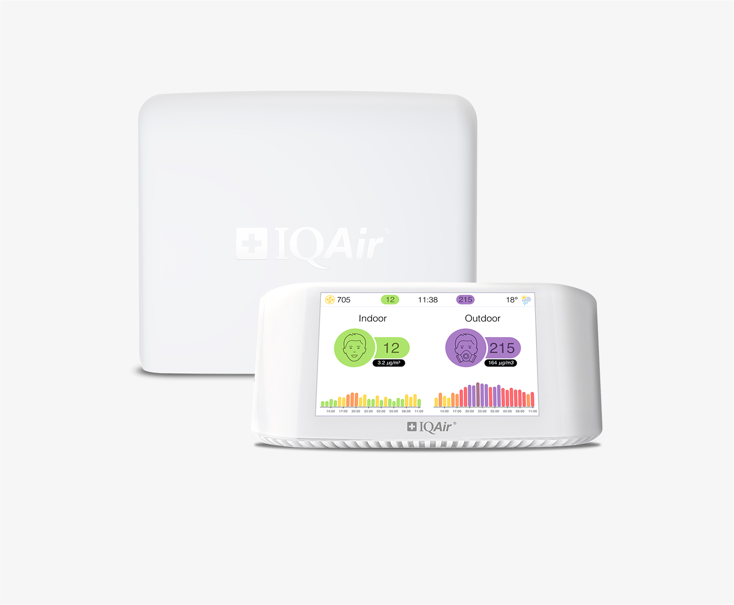
Get an AirVisual Outdoor and contribute to collecting millions of data points for the Rome map to track local air pollution
Understand air pollution and protect yourself
Rome MAP AIR QUALITY ANALYSIS AND STATISTICS
Is there much information about air quality on the air pollution map for Rome?
The pollution map for Rome is very easy to access from the main city page. Simply by clicking on the map icon will encourage a new page to open which is dedicated to all information about air quality in and around the city.
Once opened, the first thing a viewer will notice is the overall colour of the page. This is a direct indication of the air quality at that time. At the start of October 2022, the map was green which indicates “Good” air quality. The meaning of all the available colours used is explained in the legend at the foot of the page. These are standard colours throughout the IQAir website.
Possibly the next thing to notice will be the amount of coloured circles there are on the map. These show the location of the ground-level air monitoring stations. The number at their centre is the United States Air Quality Index reading. This number is calculated by measuring the levels of six of the most prolific air pollutants found in city air. They are usually Particulate Matter (PM2.5 and PM10), ozone, nitrogen dioxide, sulphur dioxide and carbon monoxide. Once calculated, the number can be used as a metric when making comparisons between other cities. It is endorsed by the World Health Organisation (WHO).
At first, some of the discs may look as though they are superimposed on top of each other but by slightly expanding the map, they will begin to separate. If any area of the city is of specific interest, then by selecting one of the discs, a whole new page will open up containing all relevant information for that part of the city.
Briefly looking back to the main city page, it can be seen that Rome was experiencing a period of “Moderate” air quality with a US AQI reading of 66. The main pollutant which was recorded was PM2.5 with a level of 19.3 µg/m³. The WHO recommends a target figure of 5 µg/m³, so at this level, Rome is almost four times higher than this suggestion.
Immediately below the air pollution map for Rome is stated the number of stations that provide data about air quality. Currently, there are ten stations which are provided and operated by two contributors. One is an individual and the other wished to remain anonymous.
Is there much more information on the air quality map for Rome?
There is a lot more information on the air quality map for Rome but the screen needs to be viewed in full-screen mode otherwise some features may remain obscured.
Once opened in this way, a list of four options should appear on the left-hand side of the page. They can each be individually deactivated if necessary to fully understand what each option does.
The first option shows the position of the ground-level monitoring stations. If they appear on top of each other, they will separate when the map is made larger. The second option would show the location of any wildfires that may be burning in the area. If any are found, then option four needs to be consulted at the same time because this option shows the speed and direction of the prevailing winds and could show where the ensuing smoke will blow to.
Option number three is perhaps the most dramatic as it can change the background colour of the map to reflect current conditions. It is currently a greenish/yellow which would indicate “Moderate” air quality.
There is more information over on the right side of the map in the form of a table. This table ranks the top seven world cities according to their level of air pollution. This can be explored further by expanding it and allowing another page to open with the rest of the world cities in descending order.
Looking below the number of stations in the area can be seen a table which ranks the stations according to their levels of pollution. The station heading the list is at Viale Pinturicchio which is showing a US AQI reading of 86 which would be “Moderate”.
The next table ranks them in order of their popularity. Once again, the station at the top of the table is at Viale Pinturicchio with 459 followers.
Can the source of air pollution be seen on the air quality map for Rome?
The source of the polluted air does not show up directly on the air pollution map for Rome, however, it is proven that people living in an urban area are exposed to a mixture of environmental pollutants. The main sources of pollution are vehicular traffic and domestic heating (especially when diesel or biomass are used).
Rome remains the capital of the car. In the city, as emerged in the recent report drawn up by Rome services for mobility, in recent years the number of private cars supplied by citizens has continued to grow. They have increased especially between 2019 and 2020 to the point that now, in the city, there are 629 cars for every thousand inhabitants which is a new national record.
In the past, combustion and heating systems in industry, crafts and households were important sources of air pollution. Since the 1990s, thanks to advances in technology, air pollution has been significantly reduced. Combustion and wood heating systems, which produce large quantities of fine dust and air pollutants, however continue to cause concern.
PM2.5 is always used as a benchmark on the air pollution map for Rome, but what is it?
Atmospheric particulate matter is a set of particles, solid and liquid, with a great variety of physical, chemical, geometric and morphological characteristics. The sources can be natural (soil erosion, marine spray, volcanoes, forest fires, pollen dispersion, etc.) or anthropogenic (industries, heating, vehicular traffic and combustion processes in general). It can be of the primary type if introduced into the atmosphere directly from the source or secondary if it is formed subsequently, following chemical-physical transformations of other substances. It is therefore a very different pollutant from all the others, presenting itself not as a specific chemical entity but as a mixture of particles with the most varied properties. The major components of atmospheric particles are sulphates and nitrates.
Rome air quality data attribution
6Contributors
- EDOARDO
1 station
Individual Contributor
 3 Anonymous contributors
3 stations
3 Anonymous Contributors


