Ambala air quality map
Live air pollution map of Ambala
2.7K people follow this city
Full screen
Contributors category
0
Government
0
Educational
0
Non-profit organization
0
Corporate
0
Individual
0
Anonymous
Station(s) operated by

*IQAir’s AQI data modeled using satellite data. Learn more
Health Recommendations
| Sensitive groups should reduce outdoor exercise | |
| Close your windows to avoid dirty outdoor air GET A MONITOR | |
| Sensitive groups should wear a mask outdoors GET A MASK | |
| Sensitive groups should run an air purifier GET AN AIR PURIFIER |
Ambala does not have air sensor data
Be the first to measure and contribute air quality data to your community.
Understand air pollution and protect yourself
Ambala MAP AIR QUALITY ANALYSIS AND STATISTICS
Is there much interesting information about air quality on the air pollution map for Ambala?
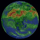
There is a wealth of very interesting information about air quality on the air pollution map for Ambala and it is really easy to access from the main city page. The air pollution map will be seen at the top of this main page and is the link to the next page which is filled with a lot of information about air quality.
When this new page first opens, the viewer will be met with a very intense colour which is a visualisation of the current state of the air. Colours can range from pale green through to dark maroon where the darker colours show worsening air quality. These standard colours are used throughout the whole IQAir website. There are also some coloured discs or circles scattered across the map which show the locations of the ground-level air monitoring stations. Each disc will reveal its own page which is filled with information relevant to that specific part of the city.
It will be noticed that each disc has a number at its centre which is the United States Air Quality Index reading for that station. This figure is derived from information gathered after measuring the levels of six of the most prolific air pollutants found in city air. These are usually, but not always both sizes of Particulate Matter (PM2.5 and PM10), nitrogen dioxide, sulphur dioxide, carbon monoxide and ozone. When the reading is established, it is used as a standard when comparing levels of air quality in different cities across the globe. Its use is actively encouraged by the World Health Organisation (WHO).
Looking back at the main page, it can be seen in the coloured banner across the top that the air quality in the middle of January 2023 was “Unhealthy for sensitive groups” with a US AQI reading of 126. The colour of the banner also reflects this figure. There were five of the main pollutants measured but it is PM2.5 that is often the main one. At the time of writing, the recorded level was 45.8 µg/m³ which is over nine times the suggested target level of 5 µg/m³ as recommended by the WHO.
Just below the air pollution map for Ambala can be seen the number of contributors there are that collate the collected data from the station which they operate. There is currently just one station which is operated by the government body which is the Central Pollution Control Board.
Can any more fascinating information about air quality be found on the air pollution map for Ambala?
There is a lot more interesting information about air quality on the air pollution map for Ambala, but the page needs to be viewed in full-screen mode for it all to be seen. There is an icon at the top of the screen which, when selected, will open the page in full-screen mode.
When the page is viewed in this manner, a list of four options will be seen down the left-hand side of the screen. These can each be turned on or off individually to get a clear picture of the effects they each have on the map.
The first option shows the location of all the ground-level air monitoring stations in the area although they may not all be under the jurisdiction of the city. The second option will show the position of any wildfires that might be burning out of control in the vicinity. During January 2023, there were no such icons on the map which means there were no significant fires burning at that time. If fires are detected, then option four needs to be consulted because it shows the speed and direction of the prevailing winds and will give a good indication of where the ensuing smoke may blow.
Option number three is very dramatic because it changes the overall colour of the map to show the current air quality. Sometimes the colour may be too intense which can be distracting, in which case, the option can be deactivated and the colour will revert back to a more subdued set of colours.
More interesting information can be found on the right-hand side of the screen in the form of a table. This table ranks the world’s cities according to their levels of air pollution. By default, only the worst seven are shown, but by opening the full ranking section, all the participating world cuties will be shown in descending order.
Just below the air pollution map for Ambala can be seen a table which lists the stations in order of their levels of pollution. There is only one station in this city which is at Patti Mehar, Ambala – HSPCB with a US AQI reading of 126 which classifies it as being “Unhealthy for sensitive groups”.
The next list ranks the stations in order of their popularity and shows the number of loyal followers they each have. The most popular station is Patti Mehar, Ambala – HSPCB with almost 10,000 followers.
Can it be seen where the polluted air comes from on the air pollution map for Ambala?
Whilst it cannot be seen directly on the air pollution map for Ambala, it is generally known that the reason for this is stubble burning in Haryana and Punjab. Dried animal dung is another contributor to air pollution because it is readily available and can even be used as currency in some places by trading them for goods. Dust also plays a major role in the city’s air pollution, but in reality, emissions from vehicles, thermal power plants and industries are more harmful.
PM2.5 is always mentioned on the air pollution map for Ambala, but how dangerous is it?
Environmental experts say that PM10 is called respirable particulate matter. The size of these particles is 10 micrometres. Particles smaller than this have a diameter of 2.5 micrometres or less. This includes dust, dirt and microscopic particles of metal. PM10 and PM2.5 increase due to dust, construction and burning of garbage and straw.
Only when the level of PM2.5 is high, does the haze increase and the visibility decreases. Not only this, these particles enter the body while breathing. Due to this, along with difficulty in breathing, there is a risk of many other diseases. Children and the elderly are the worst affected by increasing levels of PM2.5 and PM10 in the air.


