

Amsterdam air quality map
Live air pollution map of Amsterdam • 550.3K Followers • 15:00, Jun 11 Local time


Stations
Clean Air Facilities
Contributors
Government
2Diplomatic
0Non-profit
0Education
0Corporate
0Healthcare
0Hospitality
0Individual
1Top contributors in Amsterdam
Who is sharing outdoor air quality data in Amsterdam?
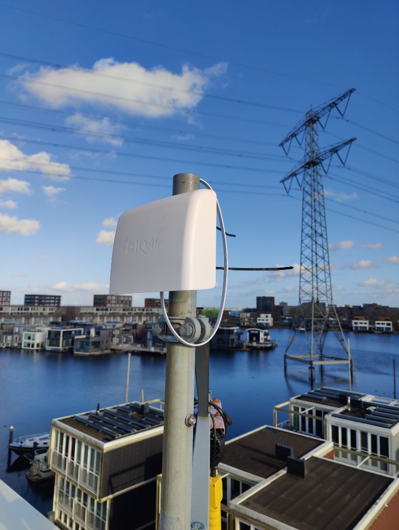
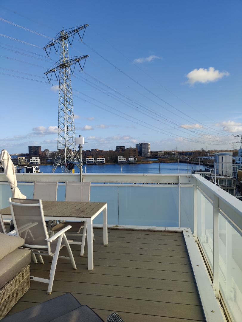
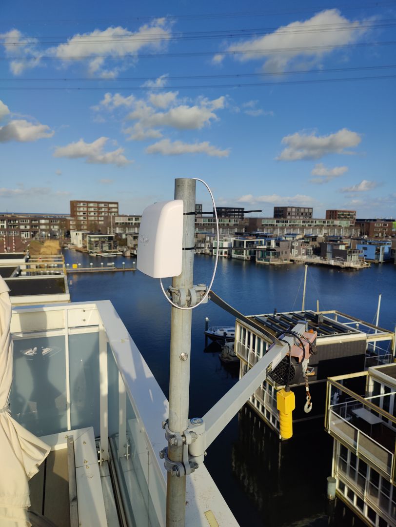
Featured station
Discover some of the best station installation in Amsterdam
Station gallery

SluisHuis, Amsterdam
6
Newest stations deployed in Amsterdam
AQI⁺ station rankingNewest stations


Learn more about global air quality


Learn more about air pollution in Amsterdam
What is the air quality index of Amsterdam?
Amsterdam is the largest and most populous city in the Netherlands with a 2018 population of over 2.5 million in the metropolitan area. At the end of 2020, Amsterdam was experiencing some “Good” quality air with a US AQI reading of 18.
The concentration of the main pollutants were as follows: PM2.5 - 4.3 µg/m³, PM10 - 3.9 µg/m³, ozone (O3) - 33.1 µg/m³, nitrogen dioxide (NO2) - 5.3 µg/m³ and carbon monoxide (CO) - 5.3 µg/m³. With figures such as these, the advice is to open doors and windows and let the fresh air into the home and to get outside and enjoy outdoor activities.
In 2019, the average annual PM2.5 figure was 10.7 µg/m³ which, according to recommended levels by the World Health Organisation (WHO) classified it as “Good”. For 4 months of the year, Amsterdam attained the WHO target figure of being 10 µg/m³ or less. 5 months classed it as “Good” with concentrations between 10 and 12 µg/m³. The remaining months of February, March and April returned “Moderate” readings between 12.1 and 35.4 µg/m³.
Is Amsterdam very polluted?
The Stadhouderskade is one of the dirtiest streets in Amsterdam. It is a street which runs through the city centre and is always congested. Local residents have noticed that if they cross the street or spend too much time close to the carriageway, they soon begin to cough and wheeze. They are mostly dissatisfied with the measure being taken by the authorities and suggest the exclusion of heavily-polluting diesel-powered trucks, but levels of pollutants are still in excess of recommended figures.
What are the air pollutants in Amsterdam?
Fine dust is a collective name for very small particles in the air. You cannot see the particles with the naked eye as they are only a few micrometres in size (1 micrometre is a thousand times smaller than a millimetre). Particles smaller than 10 micrometres are called PM10, particles smaller than 2.5 micrometres are called PM2.5 and even smaller particles are called ultra-fine particles. Soot or black carbon (BC) is also an important part of fine dust as it consists of particles that have clumped together. Particulate matter can be caused by natural sources but, more commonly, it is man-made. It is thought that up to 75 to 80 per cent of fine PM pollutants are attributed to human activity. These fine particles also remain in the air for longer periods of time.
In addition to particulate matter (PM), soot (BC), nitrogen oxides (NOx) and ozone (O3), there are also other unhealthy substances in the air, such as volatile organic compounds (VOC), carbon monoxide (CO) and sulphur dioxide (SO2), but these are in much smaller quantities at the moment.
What can be done to mitigate the effects of the poor air quality in Amsterdam?
If you are driving the car, keep the windows closed especially when in a traffic jam or heavily congested area. This way you keep some of the dirty air out. Outside the traffic jam, an open window is healthier, because the air in cars can soon become stale. Do not allow fresh air to enter the car whilst driving through long tunnels but set the fan to recirculation mode. In this way, less polluted air enters the car. However, you are not advised to do this for longer than 15 minutes. By opening two of the windows, the air inside the vehicle will quickly be replaced.
What are the effects on health through breathing in Amsterdam’s polluted air?
Air pollution is unhealthy and you can get all types of ailments and diseases from it. The elderly, sick people and young children are extra sensitive to dirty air. People with pre-existing respiratory problems such as asthma, chronic bronchitis or COPD, and people with cardiovascular disease or diabetes, can develop more complaints or even die earlier due to air pollution. Healthy people are also affected depending on the length of exposure to the dirty air, the pollutants contained within it and the concentration of those pollutants. Nitrogen dioxide (NO2) makes some people more sensitive to infections and they catch a cold more quickly. Nitrogen oxides (NOx) are not only unhealthy but also bad for nature if there is too much of them.
Fine dust and ozone (O3) can cause temporary complaints such as dry eyes, coughing, a dry throat or shortness of breath. But it also ensures that your lungs work less well efficiently. Prolonged exposure to ozone can also cause headaches, nausea and dizziness. Skin rashes have also been noted for some people.
What are the main sources of pollution in Amsterdam?
Road traffic and industry are not the only sources of these unhealthy substances. Agriculture and wood burning in and around the house also cause air pollution. Of all the unhealthy particles in the air, particulate matter PM2.5, nitrogen oxide (NOx) and ozone (O3) cause the most damage to health.
Road traffic is one of the main sources of bad air that people breathe every day. A lot of particulate matter (PM), soot (BC) and nitrogen oxides (NOx) are emitted from the exhausts of cars, buses, trucks, motorcycles, scooters and mopeds. Diesel cars in particular, emit a lot of harmful substances. But the wear of tyres, brakes and road surface also adds to the air pollution.
Industry such as steel factories and refineries, shipping and agriculture also contribute. Households can cause poorer air quality by burning wood in the fireplace, wood stove or fire basket because a lot of fine dust is released into the environment when wood is burned. Other pollutants in the home are cigarette smoke, pets and moisture. Gas stoves, central heating boilers and geysers also contribute with their emissions of nitrogen oxides (NOx).
Ozone (O3) does not come from the exhaust of cars or chimneys. Tropospheric, or ground-level ozone, as it should be known, is not emitted directly into the air, but is created by chemical reactions between oxides of nitrogen (NOx) and volatile organic compounds (VOC)s. The problem is compounded in the presence of strong sunlight so tends to intensify as the day progresses.
Air pollution is a transnational problem. A lot of dirty air arrives on the prevailing winds from as far away as the deserts in China and Mongolia. Up to 30 per cent of the particulate matter in the air can come from foreign emissions. Conversely, a large part of the substances emitted in the Netherlands also blown across the border.


