Talcher air quality map
Live air pollution map of Talcher
550 people follow this city
Full screen
Contributors category
0
Government
0
Educational
0
Non-profit organization
0
Corporate
0
Individual
0
Anonymous
Station(s) operated by

*IQAir’s AQI data modeled using satellite data. Learn more
Health Recommendations
| Reduce outdoor exercise | |
| Close your windows to avoid dirty outdoor air GET A MONITOR | |
| Sensitive groups should wear a mask outdoors GET A MASK | |
| Run an air purifier GET AN AIR PURIFIER |
Talcher does not have air sensor data
Be the first to measure and contribute air quality data to your community.
Understand air pollution and protect yourself
Talcher MAP AIR QUALITY ANALYSIS AND STATISTICS
How much interesting information about air quality is there on the air pollution map for Talcher?
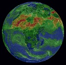
There is a lot of extremely interesting information about air quality on the air pollution map for Talcher and it is all accessible from the main city page. Clicking anywhere on the map icon will encourage a new page to open which is filled with all the latest facts and figures about air quality.
When the new page has opened, one of the first things to notice will be the intense colouration of the map. This colour is a visualisation of the state of the air quality. Colours range from pale green to a very dark maroon where the darker colours show worsening air quality. Currently, it is dark orange which shows the air quality as being “Unhealthy for sensitive groups” with a US AQI reading of 135.
There are usually several coloured circles scattered across the map which represent the locations of the ground-level air quality monitoring stations. However, not all cities have such physical stations and, instead, rely on data collected by overhead satellites. Talcher is one such city. By looking at the expanded map, the closest stations are around Halda and Kolkata, to the north east.
These discs each display a number at their centre which is the United States Air Quality Index reading or US AQI for short. This figure is calculated by taking measurements of the six most commonly occurring air pollutants found in city air. These are usually both sizes of Particulate Matter (PM2.5 and PM10), ozone, nitrogen dioxide, sulphur dioxide and carbon monoxide. Once the figure is established, it is used as a metric when making comparisons between air quality in different cities across the globe. Its use is actively encouraged by the World Health Organisation (WHO).
Briefly looking back at the main city page, it can be seen in the coloured banner at the top of the screen that Talcher was experiencing a period of air quality that was classed as being “Unhealthy for sensitive groups” with a US AQI reading of 135. The asterisk to the right of the figure denotes that the information is derived from satellite data, but the results are almost the same as from physical stations. The main pollutant was PM2.5 with a recorded level of 49.2 µg/m³ which is almost ten times higher than the suggested target figure of 5 µg/m³ as recommended by the WHO.
Are there any more facts and figures about air quality on the air pollution map for Talcher?
There are more facts and figures about air quality on the air pollution map for Talcher but the page needs to be viewed in full-screen mode to be able to see all that is available. There is an icon at the top of the page which will achieve this new size setting. A list of four options should be seen on the left-hand side of the screen which can all be turned off or on individually to see the effects they each have on the map.
The first option would show the location of the ground-level monitoring stations but as already stated, Talcher has no such stations in the area.
The second option shows the position of any wildfires there are that are in the vicinity. Currently, there are approximately four fires burning out of control to the north west of the city. When fires are seen to be burning, then option four needs to be consulted because it shows the speed and direction of the prevailing winds and will give a good indication of where the ensuing smoke might blow. Currently, the wind is blowing from the north east so will not blow the smoke in the direction of the city.
Option number three is very dramatic because it can change the background colour of the map to directly indicate the current state of the air. Some may find the solid block of intense colour to be a little distracting or confusing. In this case, the option can be deactivated and the map will revert back to a more natural set of colours which may be more appropriate and easier to understand.
There are more facts and figures about air quality on the right-hand side of the screen. A table will be seen here that ranks the top seven most polluted cities. There is also access to another page which shows the full ranking of all participating world cities in descending order.
Can the source of the polluted air be seen on the air pollution map for Talcher?
The direct source of air pollution cannot be seen on the air pollution map for Talcher, however, it is known that sulphur dioxide emissions are one of the biggest causes of air pollution. The source of sulphur dioxide in the atmosphere is the burning of fossil fuels in factories and coal-fired power stations. This also produces a very high level of nitrogen oxide.
These are particularly dangerous air pollutants that cause respiratory diseases and lung damage with chronic exposure. At the same time, being in contact with them for a long time increases the risk of heart attack and lung cancer.
Ozone is a deadly gas and even short exposure can cause respiratory problems. This can lead to asthma and even hospitalization. Ozone gas is not emitted directly from any source but is produced by the reaction of gases present in the atmosphere and sunlight at high temperatures.
PM10 and PM2.5 are always seen on the air pollution map for Talcher, but what are they?
These particles can come in many sizes and shapes and consist of hundreds of different chemicals. Some are emitted directly from a source such as construction sites, unpaved roads, fields, chimneys or fires. Most particles form in the atmosphere as a result of complex reactions of chemicals such as sulphur dioxide and nitrogen oxides, which are pollutants emitted from power plants, industries and automobiles.
The size of the particles is directly linked to their potential to cause health problems. Small particles less than 10 micrometres in diameter pose the biggest problems because they can get deep into the lungs and some can even enter the bloodstream through the alveoli. Exposure to such particles can affect both your lungs and heart.


