

Addis Ababa air quality map
Live air pollution map of Addis Ababa
15K people follow this city
Full screen


Contributors
3
Stations
3
Contributors category
1
Government
1
Non-profit organization
0
Educational
0
Corporate
0
Individual
1
Anonymous
Most polluted air quality stations
| # | station | US AQI |
|---|---|---|
| 1 | ALERT Hospital - Armauer Hansen Research Institute | 116 |
| 2 | US Embassy in Central Addis Ababa | 102 |
| 3 | Addis Ababa EPA OFFICE | 72 |
community highlight
Addis Ababa most followed contributors
Health Recommendations
 | Reduce outdoor exercise |
 | Close your windows to avoid dirty outdoor air GET A MONITOR |
 | Sensitive groups should wear a mask outdoors GET A MASK |
 | Run an air purifier GET AN AIR PURIFIER |
Become a contributor
Get an AirVisual Outdoor and contribute to collecting millions of data points for the Addis Ababa map to track local air pollution
News
The latest air quality news and resources.


Understand air pollution and protect yourself
Addis Ababa MAP AIR QUALITY ANALYSIS AND STATISTICS
What information can be gathered from the air pollution map for Addis Ababa?
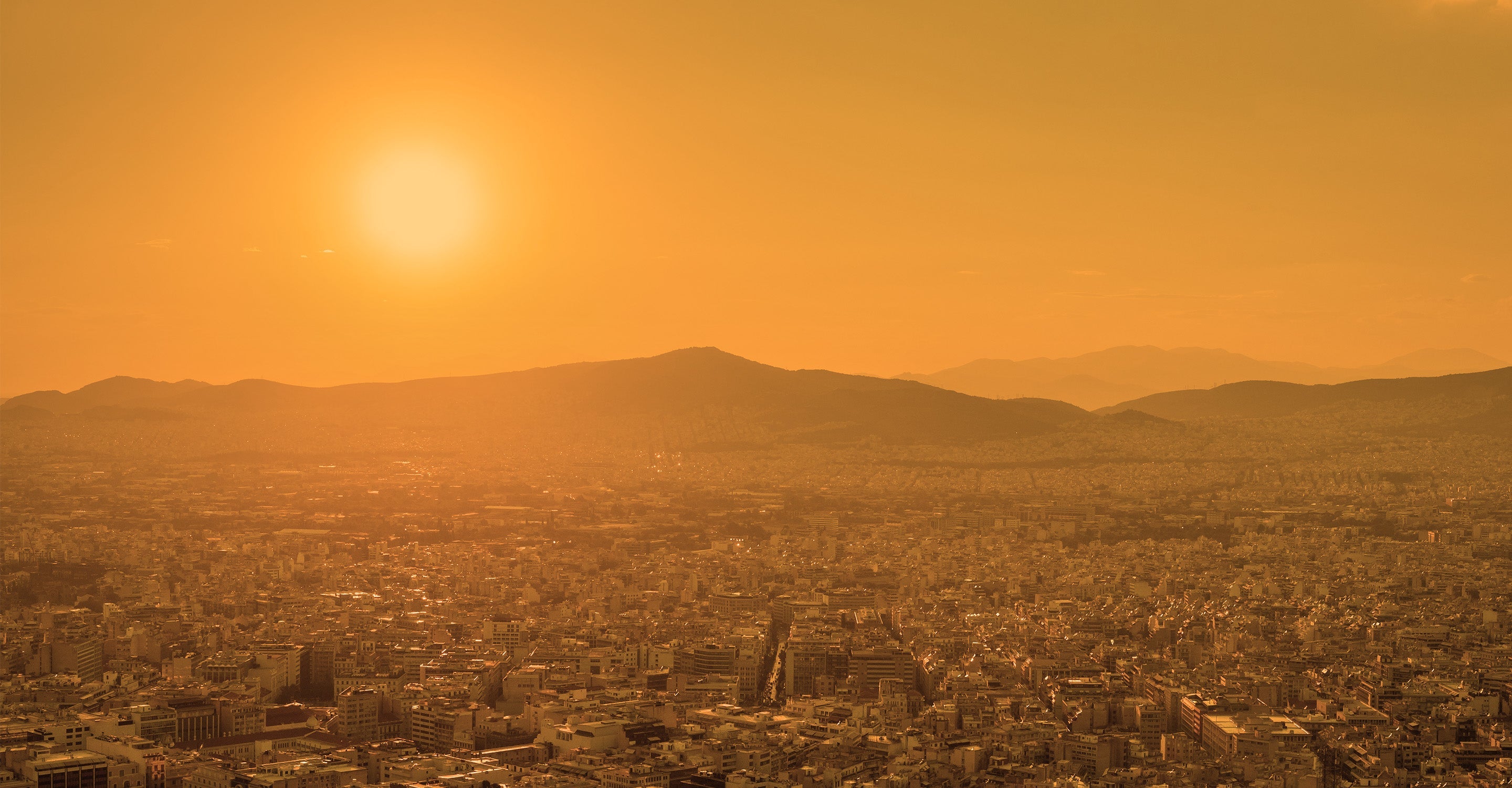
The air pollution map for Addis Ababa is easily accessible from the main city page by selecting the map option. Once selected, a new page will open which is dedicated to the overall air quality throughout the city. When the map is first opened, the viewer will see an overall colour which cleverly reflects the overall air condition through the clever use of colours. The meaning of the colours used is explained in the legend at the foot of the page. Pale green indicates good quality air, and the colours darken as the condition worsens until dark maroon represents hazardous air quality. Towards the end of the second quarter of 2022, the map colour was a dark greenish/yellow which indicates air quality which is classed as being “Unhealthy for sensitive groups”.
When the map page is first opened, the viewer will see several coloured discs often overlapping each other. However, once the map is expanded, these discs will separate and will be easier to see. They represent the location of the ground-level monitoring stations and show the representative colour and the US AQI reading as a number. This reading is calculated by recording the levels of up to six of the most prolific pollutants and is then used as a standard when comparing other cities. It is endorsed by the World Health Organisation (WHO).
When a single disc is chosen, a whole new page will open which contains all the data provided by that monitoring station for that particular area of the city. Looking just beneath the map can be seen the number of stations that contribute to the overall data for air pollution, followed by the category that the contributors fall into.
From the main city page, it can be seen that during the second quarter of 2022, Addis Ababa was experiencing a period of “Good” quality air with a US AQI reading of 37. The main pollutant measured was PM2.5 with a level of 9 µg/m³. The target figure for PM2.5 is suggested by the WHO as being 5 µg/m³, so this current level in Addis Ababa is just less than twice that ideal figure.
Can any other information be gathered from the air quality map for Addis Ababa?
When the air quality map for Addis Ababa is fully opened, there will be four options available on the left-hand side of the screen. These can be turned off or on as required. The first option reveals the location of the monitoring stations as spoken about in the previous paragraph. The second choice shows the location of any fires that are burning within the vicinity of the city. This is particularly useful when read in conjunction with option four which shows the direction of the prevailing winds. Together they will provide some insight as to whether the smoke will affect the city’s air, or not. The third option is possibly the most intriguing because it changes the background colour of the map to reflect the level of air pollution. Some may find this a little confusing but it can be deactivated and then the colours will revert to colours more associated with maps.
At the right-hand side of the page can be seen a table of world cities which are ranked according to the cleanliness of their air. The one with the poorest quality air appears at the top of the table and the rest descend from there.
Can the areas of higher pollution be identified on the air quality map for Addis Ababa?
These areas of higher pollution can be identified by looking for the disc with the largest number on it. Alternatively, listed just below the air quality map is a list of all the stations which provide data regarding air quality. At the top of the list is the station with the poorest quality air. Currently, it is the station at ECA Road with a US AQI reading of 42.
The stations are also listed by popularity, with the most popular being listed first. It appears that the station at Police Hospital is currently the most popular with 582 followers. Certain areas such as the industrial zones are often more polluted than the residential areas because of the activities carried out there. The city centre can also be more polluted at certain times of the day due to an increase in traffic during the morning and evening rush hours.
Is the source of the air pollution shown on the air pollution map for Addis Ababa?
Air pollution is caused by changes in the atmosphere, which are harmful to living things. Exposure to air pollution is everywhere, especially in cities, and can affect the entire population throughout our lives.
It has been suggested that 60 per cent of the air pollution in Addis Ababa comes from emissions from vehicles. The study was conducted by the Addis Ababa City Transport Bureau's Air Pollution Monitoring and Control Unit. The study looked at the type of vehicles and infrastructure and measured their emissions based on measuring instruments. According to the dust measurements, buses were found to be 69 micrograms per cubic meter, pickups 66 micrograms per cubic meter, and trucks 59 micrograms per cubic meter. Overuse of vehicles, traffic congestion, lack of experience in using motor vehicles, poor quality of fuel products, lack of timely and quality vehicle maintenance, and lack of consideration for green development are the causes of air pollution. Diesel-powered vehicles are the most polluting. These cause greenhouse gases, Particulate Matters, carbon dioxide, carbon monoxide, nitrogen dioxide, sulphur dioxide and hydrocarbons, which have a significant impact on human health and the environment.
PM2.5 is always used as a benchmark pollutant on the air quality map for Addis Ababa, but what is it?
PM2.5 refers to particulate matter in the atmosphere with a diameter of less than or equal to 2.5 microns, also known as particulate matter that can enter the lungs. Its diameter is less than 1/20 the thickness of a human hair. Although PM2.5 is only a very small component in the composition of the earth's atmosphere, it has important effects on air quality and visibility.
Compared with the coarser atmospheric particles, PM2.5 has a smaller particle size, is rich in a large amount of toxic and harmful substances, and has a long residence time in the atmosphere and a long transportation distance, so it has a greater impact on human health and the quality of the atmospheric environment.
Addis Ababa air quality data attribution
3Contributors
 U.S. Department of State
1 station
Government Contributor
 UNEP
UNEP1 station
Non-profit organization Contributor
 1 Anonymous contributor
1 station
Anonymous Contributor
4 Data sources
 Data validated and calibrated by IQAir
Where is the cleanest air quality in Addis Ababa?
Stay Informed. Download #1 air quality app
Air pollution forecast, pollution alerts and much more to help you plan your days and keep protected against air pollution


