Shanghai air quality map
Live air pollution map of Shanghai
2.1M people follow this city
Full screen
Stations
18
Contributors category
4
Government
Most polluted air quality stations
| # | station | US AQI |
|---|---|---|
| 1 | US Consulate in Shanghai | 149 |
| 2 | Jing An Monitoring station | 137 |
| 3 | Hongkou Liangcheng | 132 |
| 4 | Changning Xianxia | 124 |
| 5 | Yangpu Sipiao | 117 |
| 6 | Jiading Nanxiang | 114 |
| 7 | Minhang Pujiang | 114 |
| 8 | Putuo | 114 |
| 9 | Xuhui Shanghai Normal University | 114 |
| 10 | Fifteen factory | 110 |
Health Recommendations
| Reduce outdoor exercise | |
| Close your windows to avoid dirty outdoor air GET A MONITOR | |
| Sensitive groups should wear a mask outdoors GET A MASK | |
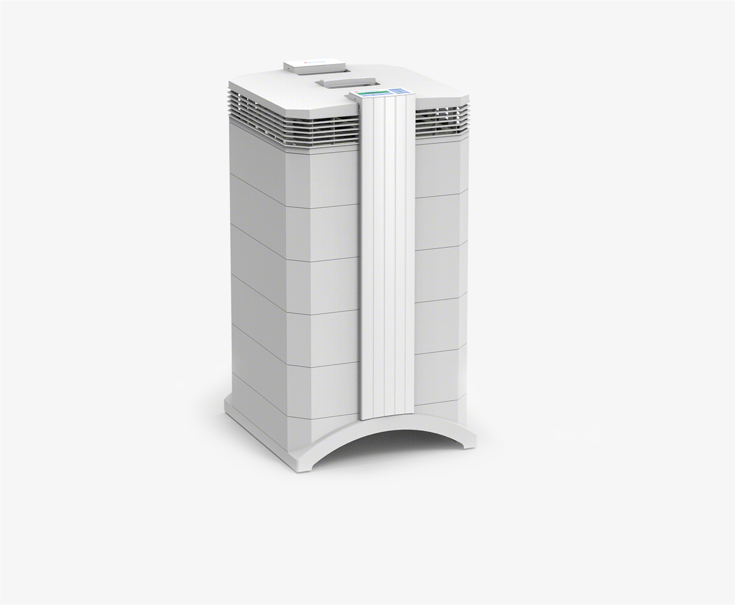
| Run an air purifier GET AN AIR PURIFIER |
Become a contributor
Get an AirVisual Outdoor and contribute to collecting millions of data points for the Shanghai map to track local air pollution
Understand air pollution and protect yourself
Shanghai MAP AIR QUALITY ANALYSIS AND STATISTICS
What information can be seen on the air pollution map for Shanghai?
The air pollution map for Shanghai is very easy to access from the main city page. Almost at the top of the page is a link to the air pollution map. Once selected, a new page will appear which is dedicated to the air quality of the city and its environs. Perhaps the most noticeable thing about the air pollution map is the overall colour. The background colour reflects the general air quality over the entire area. During the second quarter of 2022, the colour was a dark yellow which indicates “Moderate” air quality. The full meaning of the colours is explained in the legend at the foot of the page. The colours range from pale green which indicates good air quality to a dark maroon colour which shows the air quality is hazardous.
The next thing to note is all the coloured discs which appear randomly over the page. Some may look as though they are superimposed on each other. However, once the map is expanded, these discs will separate and become more distinct. These discs show the location of the ground-level air monitoring stations and also reflect the colour of their air quality. A number can be seen on them too which is the US AQI reading. This is a good indication of the level of pollution as it is an internationally recognised set of metrics which is endorsed and encouraged by the World Health Organisation (WHO). It is based on the levels of six of the most prolific air pollutants and the figure is calculated from there.
When a chosen disc is selected, a new page will open which is dedicated to that specific area of the city. Directly beneath the map can be seen the number of stations that provide the air quality data and who contributed to that data. Four of them in Shanghai are operated by the local government.
In June 2022, Shanghai was experiencing a period of “Moderate” air quality with a US AQI reading of 97. The main pollutant was PM2.5 with a level of 34 µg/m³. The WHO suggests a target figure of 5 µg/m³, so Shanghai is currently almost seven times higher than the recommended level. With pollution levels like this, doors and windows should be closed to prevent more dirty air from entering the rooms. Those who are sensitive to poor air quality should restrict their time outdoors until the situation improves.
Is any other information available on the air pollution map for Shanghai?
There is a lot more information available on the air pollution map for Shanghai, but the map may need to be expanded for it to become easier to see and understand. Once the map is in full-screen mode, a list of four choices will be noticed on the left-hand side of the screen.
The first choice will show the positions of all the air monitoring stations across the city together with their US AQI level and a coloured indication of their air quality. The second option shows the position of any fires that are burning in the area. Option four shows the direction of the prevailing winds, so together, they give a good indication as to whether the smoke will affect the air quality over the city or not.
The third choice is possibly the most dramatic as it can change the entire colour of the map page. The colour is a generalisation of the air quality for the entire region but it can be deactivated if some viewers find it confusing. Once deactivated, the map colours revert to standard colours which may be easier to understand.
Over on the other side of the page can be seen a table which ranks world cities according to the quality of their air. The most polluted are listed first and the rest follow on in order. There may be some surprises to see some cities near the top of the table!
Can areas of greater pollution be identified on the air quality map for Shanghai?
The easiest and most simple way to identify areas of high pollution is to look at the numbers on the coloured discs which can be seen over the top of the map of Shanghai. The map might need to be enlarged in order to see the numbers on them all. Alternatively, just below the air pollution map for Shanghai is a list of all the stations which provide air quality data in descending order, starting with the one with the highest level of pollution. Currently, this is situated at the US Consulate in Shanghai and has a reading of 93 which is classified as being “Moderate”.
Industrial zones and power stations can also be in areas of high pollution due to the nature of their activities. The city centre may also show elevated levels of pollution at certain times of the day.
Can the source of air pollution be identified from the air quality map for Shanghai?
Among the local emission sources, mobile sources such as motor vehicles, ships, aeroplanes, and non-road mobile machinery account for 29.2 per cent, industrial production accounts for 28.9 per cent, coal burning accounts for 13.5 per cent, dust accounts for 13.4 per cent, and agricultural production. Other sources such as combustion and natural sources accounted for 15.0 per cent. Among the mobile sources, the pollution emission contribution of motor vehicles accounts for more than 1/3.
PM2.5 is always seen on the air quality map for Shanghai, but what is it?
Natural processes also produce PM2.5, its main source is anthropogenic emissions. Humans not only directly emit PM2.5, but also emit certain gas pollutants, which are converted into PM2.5 in the air, under the influence of ultraviolet light. Direct emissions are mainly from combustion processes, such as the combustion of fossil fuels (coal, gasoline, diesel), biomass (straw, firewood), and waste incineration. The gaseous pollutants converted into PM2.5 in the air mainly include sulphur dioxide, nitrogen oxides, ammonia, and volatile organic compounds. Other anthropogenic sources include road dust, construction dust, industrial dust and kitchen fumes. Natural sources include dust disturbed by the wind, volcanic ash, forest fires, floating sea salt, pollen, fungal spores and some bacteria.
Where is the cleanest air quality in Shanghai?
- US Consulate in Shanghai 149
- Jing An Monitoring station 137
- Hongkou Liangcheng 132
- Changning Xianxia 124
- Yangpu Sipiao 117
- Jiading Nanxiang 114
- Minhang Pujiang 114
- Putuo 114
- Xuhui Shanghai Normal University 114
- Fifteen factory 110
- Baoshan Temple Walk 105
- Pudong Zhangjiang 97
- Putuo Monitoring Station 97
- Pudong Monitoring Station 95
- Pudong Huinan 88
- Luwan Primary School affiliated to Shizhuan 82
- Pudong Chuansha 80
- Chongming Shangshi Dongtan 33


