

Zurich air quality map
Live air pollution map of Zurich
35.8K people follow this city

Full screen


Contributors
9
Stations
9
Contributors category
4
Government
0
Non-profit organization
0
Educational
0
Corporate
5
Individual
0
Anonymous
Most polluted air quality stations
| # | station | US AQI |
|---|---|---|
| 1 | Heubeeribüel | 32 |
| 2 | Stampfenbachstrasse | 28 |
| 3 | Schimmelstrasse | 25 |
| 4 | Allmendstrasse | 23 |
| 5 | Am Wasser 69 | 23 |
| 6 | Dolder Waldhaus | 23 |
| 7 | Hoengg Limmat | 23 |
| 8 | Drusbergstrasse | 22 |
| 9 | Zürich Rosengartenstrasse | 20 |
Health Recommendations
 | Enjoy outdoor activities |
 | Open your windows to bring clean, fresh air indoors GET A MONITOR |
community highlight
Zurich most followed contributors


Become a contributor
Get an AirVisual Outdoor and contribute to collecting millions of data points for the Zurich map to track local air pollution
News
The latest air quality news and resources.


Understand air pollution and protect yourself
Zurich MAP AIR QUALITY ANALYSIS AND STATISTICS
What information can be gained by studying the air quality map for Zurich?
When the air quality map for Zurich is first opened, the viewer will see many green discs, each with a number on them. Some of them will be overlapping but as the map is expanded, the discs will begin to separate and be able to be seen more clearly. The numbers represent the US AQI reading which is an internationally recognised set of metrics which determine how polluted a city is and can be used in direct comparison with other cities across the world. It is endorsed by the World Health Organisation (WHO).
The significance of the colours is explained in the legend at the bottom of the expanded screen. The colours range from pale green which shows good quality air through yellow, orange, red to purple and maroon which indicates hazardous quality. These colours are standard across the entire IQAir website. The overall colour of the background of the map is also a reflection of the general air quality. As all of the discs over Zurich are green, the background to the map takes on a greenish hue.
Each individual disc represents the location of an air monitoring station. If selected, a new page will open which will be dedicated to that particular station and will give precise details of the local environs. The main pollutants will be listed which normally include PM2.5 as the major pollutant. Further down the page will be a brief weather forecast giving the temperature, humidity, wind speed and air pressure, followed by a forecast for the next few days. This forecast can be useful if planning to travel shortly.
There is also a symbol which represents any wildfires which are burning in the immediate vicinity and whose smoke could easily affect the air quality over the city. This is more useful when looking at the wind direction as it will be seen whether or not the ensuing smoke will drift across the city or not.
Can any other information be had from the air quality map for Zurich?
Directly under the map is listed the number of contributors to the information given on the map as well as the number of stations supplying the information. There were seven stations supplying the information for Zurich in May 2022. These stations list their US AQI numbers in descending order to make it easier to see which is the cleanest area of the city. There then follows a table of the most popular stations and shows how many people “follow” them for up-to-the-minute information.
On the left-hand side of the map screen are four choices as to what is displayed on the map. The viewer has the choice to turn these on or off. There is the location of the air monitors, the position of any fires, the list of air quality and the wind direction.
On the right-hand side of the screen can be seen a table which shows the air quality of cities across the world, showing the most polluted at the top of the table. This can be quite interesting when used as a comparison to your home city.
Ideally, the main city page and the air pollution map page should be read together so as to obtain as much relevant information, as possible. It can be seen that there is a fire burning less than forty kilometres away from Zurich. The US AQI reading was 34 during the second quarter of 2022, the main pollutant being PM2.5 with a level of 4.1 µg/m³.
Can the worst areas for air pollution be identified on the air pollution map for Zurich?
The only way to identify the areas of poor air quality is to find the disc with the highest number on it. As stated before, the higher the number the poorer the air quality. For Zurich, it is a little more difficult because all the discs are green so all indicate “Good” air quality. It is maybe easier to look at the various readings published by the stations. Now it can be seen that the station at Zürich-Heubeeribüel had the highest US AQI reading with a figure of 36. However, this was still classified as “Good” air quality. Certain areas in the city centre may experience high levels during the commuting periods each day.
You will see some brief advice on how to minimise the risks of exposure to polluted air, and various other pieces of valuable information just a “click” away.
Is the source of air pollution shown on the air quality map for Zurich?
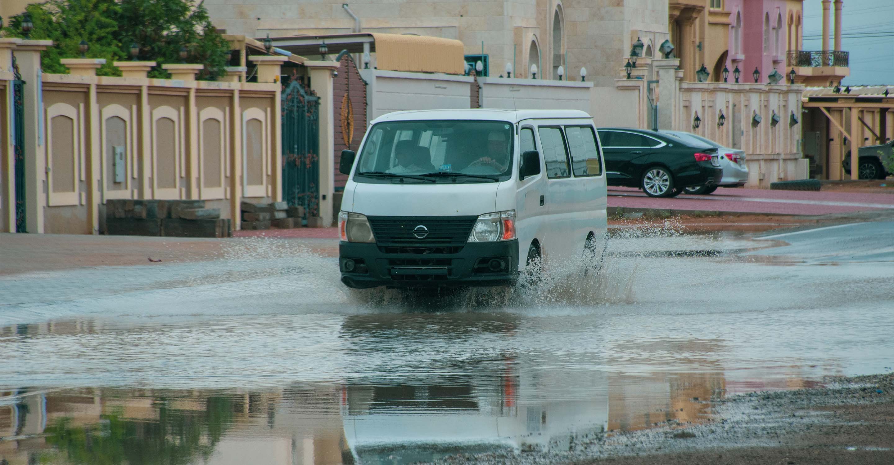
Air pollution is generally higher in urban areas than in rural areas. The population of many cities in Europe and around the world suffers from poor air quality. In many places, the limits in force for the concentrations of atmospheric pollutants are not respected. The increase in air pollution in cities is partly due to the high population density, the intensity of traffic and industrial activity. On the other hand, a dense urban structure hinders the mixing of air near the ground, which favours the accumulation of atmospheric pollutants and therefore high concentrations. Not without consequences: in many cities, this results in negative effects on the health of the population.
Over the past three decades, actions have been taken locally, nationally and internationally to reduce emissions of air pollutants. These measures have been effective and have made it possible to significantly improve air quality in Switzerland.
PM2.5 often appears on the air quality map for Zurich, but what is it?
The particles called PM2.5 are particles whose diameter is 2.5 microns (μm). Like all particles, they are made up of a mixture of different chemical compounds. They are emitted mainly during combustion phenomena or formed by chemical reactions from precursor gases present in the atmosphere.
At concentrations to which most urban and rural populations in developed and developing countries are exposed, particulates have adverse health effects. Chronic exposure contributes to increasing the risk of contracting cardiovascular and respiratory diseases, as well as lung cancers. Health effects are dependent on particle size. Fine particles, less than 2.5 µm, have a long-term impact on cardiovascular health. PM2.5 particles from road traffic also affect neurological health (cognitive performance) and perinatal health.
Zurich air quality data attribution
9Contributors
 Bodensee Konferenz Luft
4 stations
 CiteAir - Air Quality Now Europe
1 station
4 Government Contributors


6 Data sources
 Data validated and calibrated by IQAir
Where is the cleanest air quality in Zurich?
Stay Informed. Download #1 air quality app
Air pollution forecast, pollution alerts and much more to help you plan your days and keep protected against air pollution


